about Human Hive Global.
Founded in 2015 by Darren Abrahams and Kate McAllister, The Human Hive began with a simple act of solidarity, transforming an old school bus into a mobile classroom in the Calais Jungle. From that seed grew Crisis Classroom and later The Human Hive, a global community that works with people, not for them. Through education, collaboration, and creativity, it helps communities face shared challenges and build regenerative futures. With its ChangeMaking space in the Dominican Republic, The Hive connects and trains changemakers worldwide, nurturing the growth of people, places, and the planet.
my journey.
One of my favorite projects, and one that stands out for its creative freedom and joyful energy.
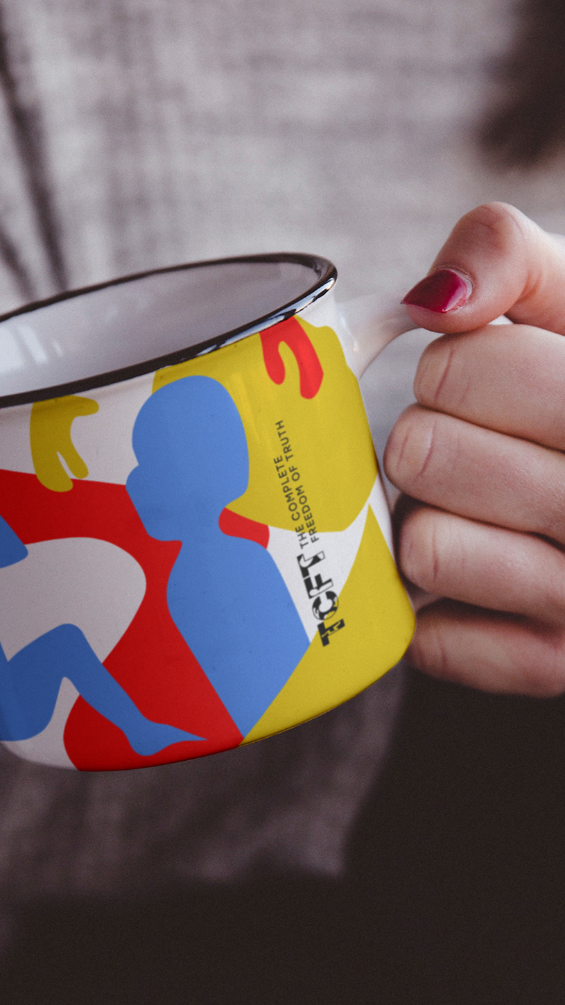
Human Hive’s visual identity needed to evolve beyond a logo and express its full personality across many mediums, including websites, T-shirts, and eBooks. Their bold and playful spirit had to be present in every detail.
Human Hive’s visual identity needed to evolve beyond a logo and express its full personality across many mediums, including websites, T-shirts, and eBooks. Their bold and playful spirit had to be present in every detail.
This collaboration was truly special, filled with openness, trust, and opportunities to explore new ways of shaping the brand. Every step of the process felt alive with creativity, and we are deeply proud of the result. A heartfelt thank you to Human Hive for trusting us to capture their vision and translate their humanity into a vibrant visual story.
The chosen typeface reflects what makes us human: the quirks, traits, and differences that shape who we are. It celebrates individuality and reminds us that diversity brings depth, strength, and character to the whole.
Take a moment to explore. Scroll, navigate through the menu and discover the design within the interactive prototype below.
the e-book.
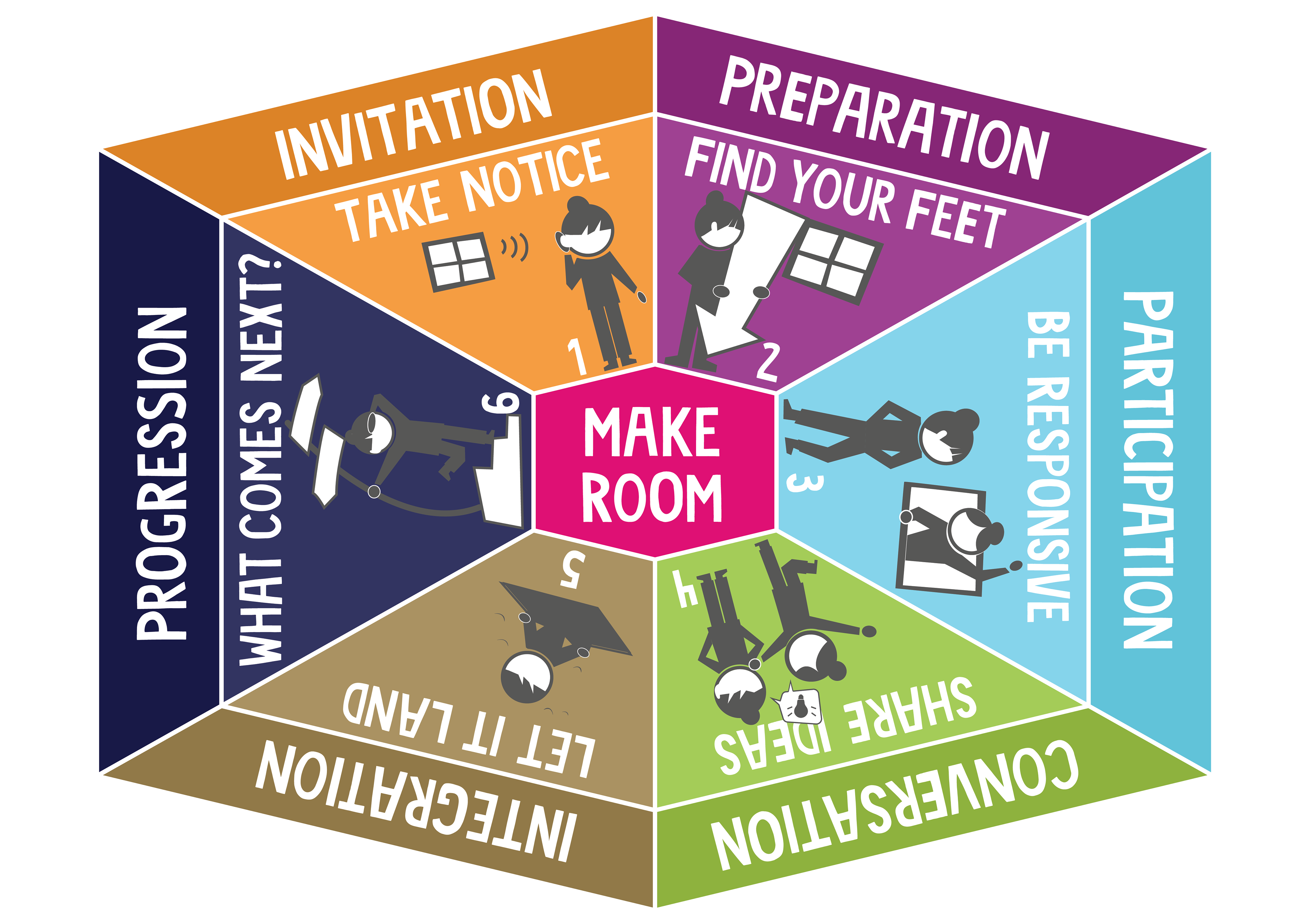
“How to Make a Difference, With, Not For One Another” is an eBook about empowerment and the meaningful ways we can support each other. It explores how real change begins when we act alongside others rather than on their behalf.
The illustrated characters serve as visual guides, offering simple milestones that help readers remember each step toward helping others and growing as active members of their communities.
Through the design, I wanted to create a visual experience that feels both clean and playful. Key ideas are highlighted to make the content easy to follow, engaging, and memorable, creating an inviting read that encourages reflection and action.
the characters.
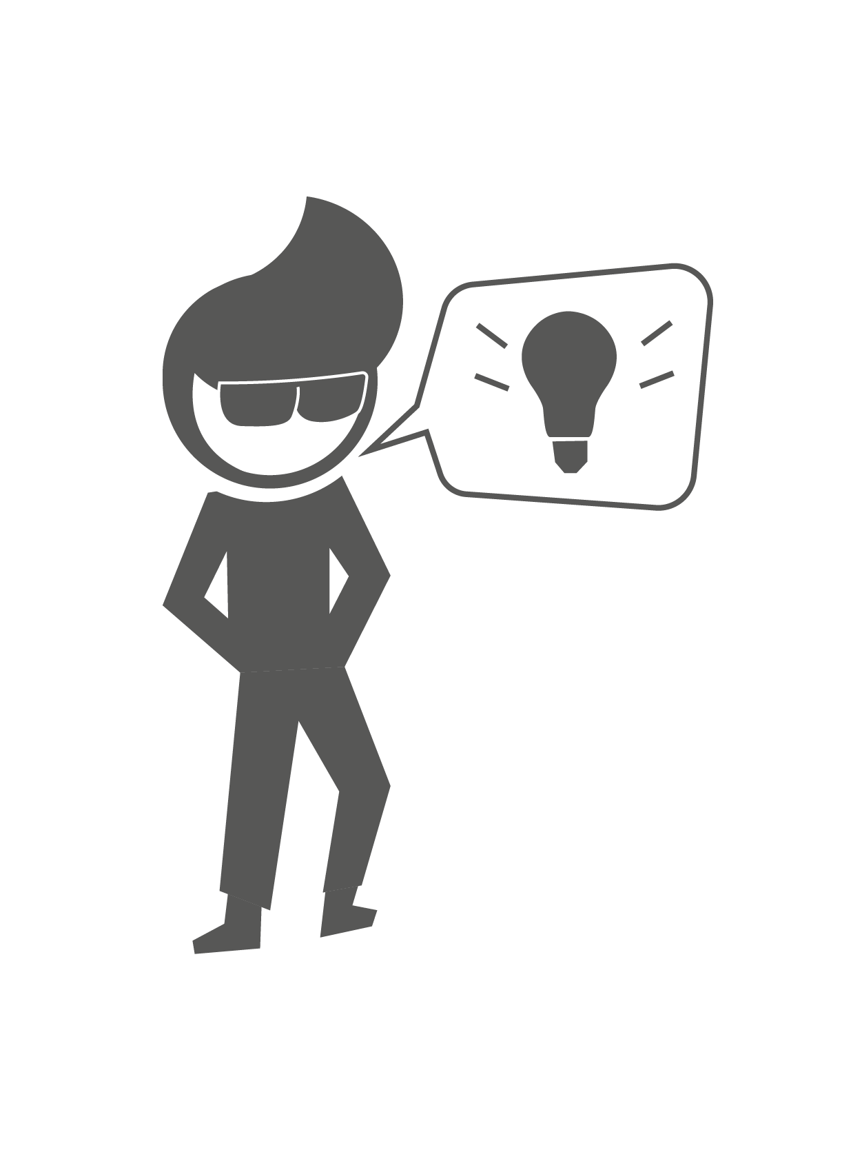
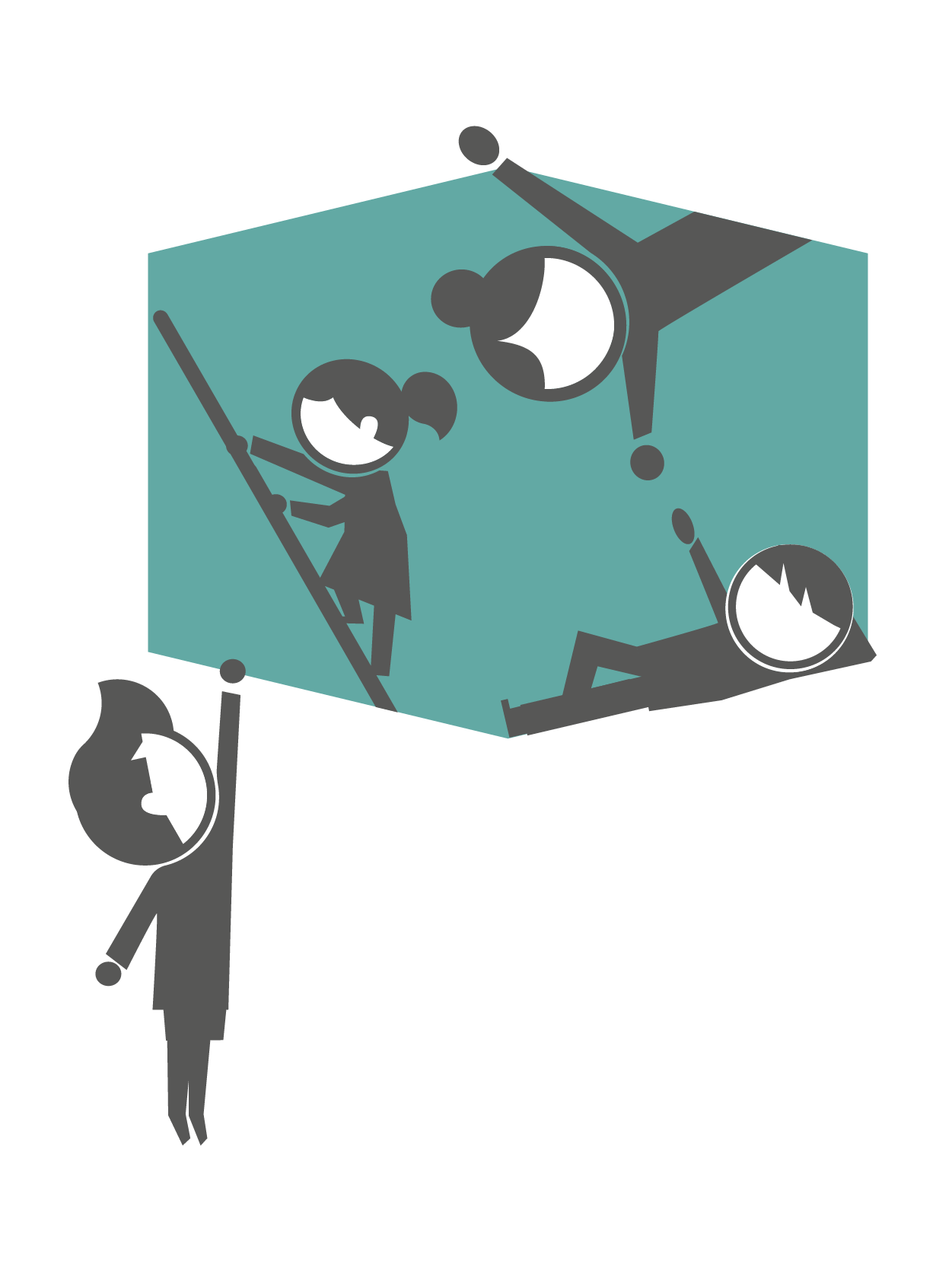
The characters are at the heart of the experience. They act as playful guides, leading the way through the website and brand materials with curiosity and warmth. Each one points out what matters, offers small hints, and adds those subtle touches of personality that make the journey engaging and memorable.
Fully custom and full of charm, they bring a spark of joy that makes the visual story feel alive. They interact naturally with both the viewer and the surrounding elements, reflecting the optimism of a child unafraid to explore. Together, they offer insight and connection, much like a hive, a reminder of how our individual stories come together to form something greater.